#1 - CSS Grid Item Placement: My first frontend challenge

I've recently finished my first Frontend Mentor challenge. As I'm just starting, I chose one that seemed the easiest. Nonetheless, I learned a lot with it and I'm here to share a little of what I've learned completing it. If you want to understand a little better how the grid positioning algorithm works, I hope you find this content useful.
English is not my main language, but I'm trying to improve on it. If you find any errors, please let me know: @arthurvmdantas.
The challenge
I picked the Stats preview card component[1] challenge. I built it with pure HTML and CSS, mobile-first, and CSS Grid for the layout.
For my development environment, I used CodeSandbox [2]. It's a nice alternative if you don't want to configure a new environment. Besides, you can connect a GitHub repository and run commits directly from your sandbox.
You can access my repository and the final result.
The layout
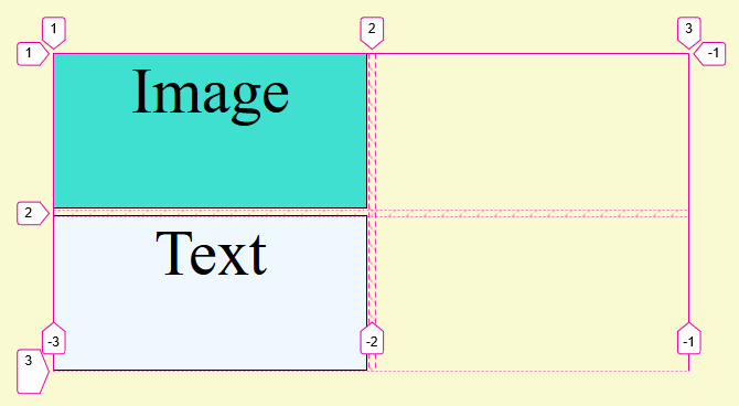
I've created a very simple grid: 1x2 (1 column x 2 rows) for the mobile layout and a 2x1 (2 columns x 1 row) for the desktop one. On mobile, the first grid item (cell) is an image and the second is text content. On desktop, it's the opposite: the first grid item is text and the second is an image. You can see the layout configuration in the image below.

The challenge
The problem to be faced was simple: swap the grid items accordingly when changing the layouts. Or, in other words, specify explicitly the items' positions. Can I do that with CSS? Of course!
Looking for a solution, I stumbled with a simple and direct solution. I just had to add a grid-row: 1 declaration to my text grid item.
Now we can feel tempted to move on without knowing well what really happened, but I think that it's best to focus on the fundamentals and understand what is going on behind the curtains here, even if only briefly.
Starting to understand
The grid-row property is, in fact, a shorthand for the grid-row-start and grid-row-end properties which define the grid item's starting and ending lines respectively. There are also grid-column-start and grid-column-end properties that do the same but for columns. You can read more in this CSS Tricks article [3].

So, grid-row: 1 is the same as:
{
    grid-row-start: 1;
    grid-row-end: auto;
}
But, wait a moment... In the desktop layout, the text content was in the first line already (same with the image); the only difference was the explicit declaration (although keeping the same value). This left me with two questions:
- Why the grid items swapped their positions when I used an explicit declaration?
- I want to change the columns' order but I'm using a line declaration. Why is that?
The auto-placement algorithm
When creating a grid, you can specify using the rules mentioned above, the position of each grid item; but, we usually don't do this and we set the position of just a few of them (or maybe none). In this case, we let an algorithm [5] determine the correct position of each grid item that doesn't possess an explicit position (auto placed items) [6].
In a nutshell, the algorithm reserves the areas defined by the grid items with explicitly positioning first and allocates the remaining items to the remaining available spaces. For that, it keeps an auto-placement cursor (current position) which defines the next "insertion point" while taking into account properties like grid-auto-flow that can alter the items' order.
It is worth noting that the algorithm can create additional columns and rows if it sees fit. Thus there is the explicit grid - created using grid-template-columns or grid-template-rows for example - and the implicit grid - that the algorithm creates when the need arises.
By explicitly specifying the starting line of the text item with grid-row: 1 we are sure that it'll necessarily start at that line. The same is true when specifying columns. However, in this case, the columns were swapped even if I didn't specify a column position. The first question remains.
How about my second question? Why not use a column rule if I want to change the items' column order? It would make more sense, wouldn't it? I decided to replace grid-row: 1 with grid-column-start: 1, but the result was not what I expected.
I expected the same result when using grid-row-start: 1 because I'm explicitly specifying the text item position, but that was not the case. The text item went to the first column as it should but now it's positioned in the second row. The algorithm created an implicit grid.
Continuing the experimentation, I decided to specify the column of the image item. Now I had one item for each column.
#text {
    grid-column-start: 1;
}

#image {
    grid-column-start: 2;
}
And the result, again, was not what I was expecting. The text item continued to occupy the second row.

What if I specify that the text item must be on the first row? I can do that with grid-row-start:
#text {
    grid-column-start: 1;
    grid-row-start: 1;
}

#image {
    grid-column-start: 2;
}

Now it works! But there is a detail that you may have noticed: for it to work, I had to go back to using a rule to define the row position.
Actually, if I remove the grid-column-start declarations from the last CSS snippet, I get the same result and I'm back to the beginning when I was using just grid-row: 1.
The detail
Still not knowing exactly what was happening, I posted my questions on StackOverflow [8]. And then I was shown the detail that had gone unnoticed in my first reading of the algorithm.
The second and fourth steps of the algorithm are [5]:
-
- Process the items locked to a given row.
-
- Position the remaining grid items.
Now the mystery has been solved. ✔ When I used grid-row: 1 for the text item, it was processed first and was allocated to the first available grid area (row 1, column 1); that is, the text item was processed in step 2 and the image item was processed in step 4.
But when I used grid-column-start: 1 for the text item, both items were processed in step 4 and, in DOM order, the image item was processed first and was allocated to the first position (row 1, column 1). Since the text item now necessarily had to start in column 1, the algorithm created a row (implicit grid) below so that it could be in the correct column.
When I added grid-column-start: 2 for the image item, the text item remained on line 2 because of the cursor I mentioned above; it will position the next item right after the last positioned item (in this case, the image item). This behavior can be changed if the grid is set to dense (it is sparse by default) [7].
Conclusion
Even a simple exercise like the one I chose can teach us fundamental details if we dig deep enough. And, after experiencing so much and breaking my head trying to understand the reason for things, I will hardly forget this lesson. It's a little tiring at the time, but it's worth it.
Finally, another method to change the order of the items is with the order [9] property. But be aware that this change is only visual and may not be sufficient for your needs:
Since order is only meant to affect the visual order of elements and not their logical or tab order. order must not be used on non-visual media such as speech.
References
[1] - [https://www.frontendmentor.io/challenges/stats-preview-card-component-8JqbgoU62]
[2] - [https://codesandbox.io]
[3] - [https://css-tricks.com/snippets/css/complete-guide-grid/]
[4] - [https://developer.mozilla.org/en-US/docs/Web/CSS/CSS_Grid_Layout/Basic_Concepts_of_Grid_Layout]
[5] - [https://drafts.csswg.org/css-grid/#auto-placement-algo]
[6] - [https://developer.mozilla.org/en-US/docs/Web/CSS/CSS_Grid_Layout/Auto-placement_in_CSS_Grid_Layout]
[7] - [https://developer.mozilla.org/en-US/docs/Web/CSS/grid-auto-flow]
[8] - [https://stackoverflow.com/questions/68595914/css-grid-item-placement]
[9] - [https://developer.mozilla.org/en-US/docs/Web/CSS/order]